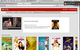
The Structure Principle
The Structure Principle is all about the visual layout of the user interface. The way things are grouped and organized are extremely important when dealing with structure. Certain things need to be designed appropriately for the user to get around. Each section must be recognizable and constructed in an orderly fashion. The architectural structure of the interface works best if it’s simple and effective. Netflix does just that.
Three techniques that Netflix uses are: Don’t Create Busy User Interfaces, Navigation Within Screen is Important, and Group Things Effectively
Don’t Create Busy User Interfaces- Netflix has a very clean and simple user interface. There is a small amount of information needed for this program to be successful. It is not overwhelming and crowded with uneccesary and non-useful items.
Navigation Within Screen is Important- Navigating your way through Netflix is straight forward. The important information is situated within the navigation bar that rests at the top left of the screen. All the information works from left to right and top to bottom which appears to be the standard.
Group Things Effectively- Everything in Netflix is appropriately grouped for effective navigation and usability.
The Simplicity Principle
Simplicity is key in a user interface. Not too simple in the fact that you cannot find what you are looking for, but simple in the fact that everything you are looking for and/or may be interested in is displayed right in front of you and at the ready.
This website, Filesmelt, keeps it simple right off the bat but it also offers multiple options for users who prefer a more complex layout. This site sticks solely to its purpose while catering to the needs of any user.
Common, repetitive tasks are easy on this site. Its simple layout offers the option to continuously upload more and files.
The website communicates clearly and uses minimal text other than to guide the user in the right direction.The site also offers shorcuts to their simple, advanced, and experimental layouts so that you can switch on the fly.
The Visibility Principle
The Visibility Principle expects the UI to have its options neat and organized without any unnecessary options or distractions going on. For example, the Facebook interface is straight to the point and easy to maneuver throughout the site without any complications. Getting from one page to another is simple and immediate.
Three techniques that Facebook applies are:Following the Contrast Rules, Group Things Effectively, and Consistency.
1. Following the contrast rule- Facebook follows the contrast rule to perfection. The text is always visible and easy to read. They use black text on a white background and white text on a blue background where necessary.
2. Group things effectively- Facebook effectively groups options in a way where it is easy for the user to get around. The most important information is stored on the top left side of the page and works it’s way down. It has quick links to private messages and notifications and works down to Favourites, Groups, Apps, Lists, and Friends On Chat.. The options that are used most are displayed appropriately for ease.
3. Consistency- Facebook is a great example for consistency. Every page you enter has the same colour scheme and your options are always located in the same spot on the page for easy and quick browsing. The search bar is always in effect at the same location and always the same size.
The Feedback Principle
Microsoft Word is likely among the easiest to understand The Feedback Principle in. The Feedback Principle refers to the action in a program, in which the user is informed of all changes, alterations, condition, exceptions, and ect. By using concise language and symbols per reaction, it keeps the user connected with the program, and allows the user to expect certain things from the software, namely positive, each time they use it.
Users want feedback from their software, so as they may feel connected with it, and are interacting on a level to level basis. Microsoft Word effectively presents this by giving direct, immediate feedback in the form of symbols, while also giving suggestions to fix issues, and giving heads up as per any alterations that have been made without the user’s direct consent, but still suit with the user’s most likely desired result. This tends to the technique of assuming that the user is going to make mistakes, and does not punish them for their errors. When a user searches for a way to bold a piece of text, they expect to be able to press a button in order to do so. The location of this, being a common task, must be concise, and apparent to the user, without forcing them to search for the desired result. By grouping the most important, commonly used options onto the home page, and all like objects together in their own, clearly labeled tabs, we can expect that by pressing a tab, we will be navigated off to information that contains such, as relayed.

The Tolerance Principle
Tolerance is also key within a website's user interface. If a website does not tolerate simple user mistakes, then it will drive users away rather than attracting them.
Ontario.ca was designed with help in mind, the entire design was made to assist Ontario residents so naturally it is designed with a certain amount of user understandability.
The design is flexible and displays all important links directly where the user can see. The website offers various degrees of help in order for the user to correctly enter and recieve information. All fields on this website inform the user if mistakes are made.
The Reuse Principle
The Reuse Principle focuses on the user’s ability to quickly, and easily understand the workability of a program, and have ease upon reuse. The program should encourage the user’s comfort in repeating the same task without having to go through tedious processes that require time and effort, each time.
The program, aTube Catcher, is a video downloading program, and an excellent example of the Reuse Principle, as it effectively uses its simplistic platform and interface to allow the user to utilize it to its full potential and purpose, using only a few steps.
In order to create an effective use of the Reuse Principle, the program utilizes user interface design techniques, such as making the software intuitable. A first time user is almost never going to know how to work a program, so initially, they will muddle around, trying to figure out the works. By limiting the interface to the most important parts of the software, and making them clear and concise, it creates the ability simply pick up the program, and effectively use it for what it’s intended to do, with no issues. In order to make the software intuitable, one must utilize a simple format, and user interface, by keeping the interface simplistic, and like objects grouped together. aTube Catcher also utilizes the route of clearly labeling all components to keep the design intuitive, and keep the user from second guessing their choices.


